How to Pair Colours Like a Stylist
No man is an island, and no colour stands alone.
Colour schemes are the secret to creating outfits that look polished and intentional.
By understanding how different colours work together, whether through harmony, contrast, or subtle variation, you can elevate even the simplest wardrobe pieces.
From the sleek elegance of a monochromatic look to the bold energy of complementary pairings, using colour schemes in fashion helps you express your personality, highlight your best features, and build a wardrobe that feels stylish and cohesive.
The easiest way to understand colour schemes is by looking at the colour wheel. It’s your roadmap to pairing shades in a way that feels stylish and effortless.

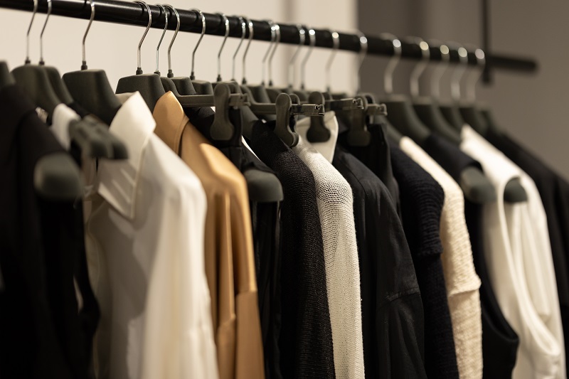
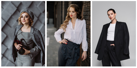
Achromatic
- Meaning: “Without colour.”
- Palette: Black, white, and grey.
- Effect: Clean, minimal, timeless, and sophisticated.
Style Tip
Achromatic outfits are great for sleek, professional outfits, or when you want the focus to be on texture, silhouette, or accessories rather than colour.
Outfit Inspiration
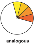
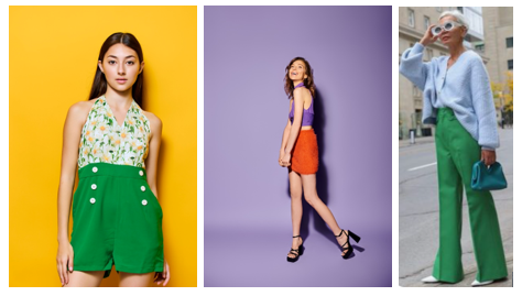
Analogous
- Meaning: Colours that sit next to each other on the colour wheel.
- Palette Example: yellow and green, orange and purple, green and pale blue.
- Effect: Harmonious, calming, and pleasing to the eye.
Style Tip
Works well when you want a polished, coordinated look.
Add contrast with neutrals or metallics to keep it from feeling too “matchy.”
Outfit Inspiration
Clash (sometimes called “contrasting” or “discordant”)
- Meaning: Colours that seem to “clash” because they are not naturally harmonious. Often bold or unexpected pairings. Combines a colour with the hue to the left or right of it complement colour.
- Palette Example: Red and pale bule, yellow and blue, or red and yellow.
- Effect: Eye-catching, energetic, and daring.
Style Tip
Works well for making a statement. Keep silhouettes simple if you’re using loud colour combinations.
Outfit Inspiration

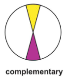
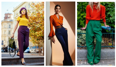
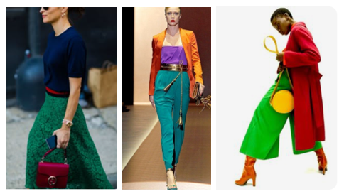
Complementary
- Meaning: Colours directly opposite each other on the colour wheel.
- Palette Example: Yellow and Purple, Orange and Blue, Red and Green.
- Effect: High contrast, vibrant, and dynamic.
Style Tip
Use one as the dominant colour and the other as an accent to avoid looking too harsh.
Outfit Inspiration
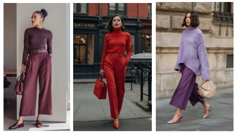
Monochromatic
- Meaning: Different shades, tones, and tints of a single colour.
- Palette Example: Navy, sky blue, and baby blue, red, burgundy.
- Effect: Elegant, streamlined, and modern.
Style Tip:
Play with textures, patterns, and fabrics to keep the look from feeling flat.
Outfit Inspiration
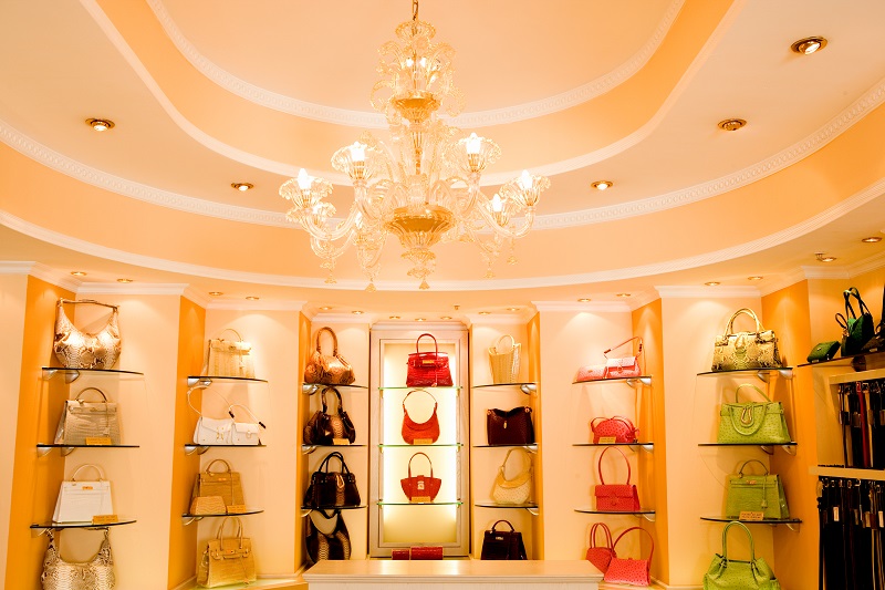
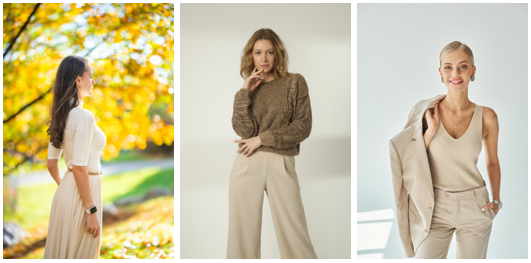
Neutral
- Meaning: Colours not strongly found on the colour wheel, often understated.
- Palette: Black, white, grey, beige, taupe, navy, olive, cream.
- Effect: Versatile, timeless, and adaptable.
Style Tip
Neutrals form the backbone of most wardrobes and mix easily with brights, pastels, or each other.
A neutral palette is often associated with the Quiet Luxury aesthetic.
Outfit Inspiration
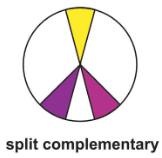
Split Complementary
- Meaning: One base colour plus the two colours on either side of its complement.
- Palette Example: Red, green and blue, .purple, orange and green, red, yellow and green.
- Effect: Balanced but lively, less intense than direct complementary schemes.
Style Tip
Let’s you use colour boldly without it feeling overwhelming. Works well for playful, stylish outfits.
Outfit Inspiration
Style is about harmony, and nothing brings harmony quite like the right colour pairing. When in doubt, stick with the classics.
These timeless combinations serve as building blocks for a wardrobe that feels fresh, well-coordinated, and effortlessly stylish.
The best colour in the whole world is the one that looks good on you.
Coco Chanel
All images in this blog post courtesy of Pinterest